May 31, 2012

Ninja Turtle

I have to say I was really tempted to add some extra details to this model. A pair of katanas and a headband would be a great addition. The stock model is fairly fantastic without anything added on. I don't think the Ironback is the best beast in the limited selection of the Blindwater Congregation but it looks cool, that is good enough for me. I wanted to paint him to stand out a litle from the rest of the army which is mainly brown. I ended up painting him mainly brown. I don't know what it is but I can't seem to branch out into something more vibrant. The skintone you see here is Scorched Brown (GW) highlighted with Sunburst Yellow (GW). It gives an interesting green/yellow tone to the final few highlights. I thought it wuld be more vibrant but I think the complementary tone on the shell doesn't help it to pop.

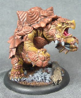
I painted the shell with Scorched Brown highlighted with Parasite Brown (Vajello). I wanted a strong orange colour. I think it worked out okay but a lot of the depth is lost. I am considering some brown glazes to bring out the detail on the shell and scales a little better. I don' know yet if that would work. I have heard that a blue glaze can work really well with brown but I would be too scared to try that here. Its just too much to have to fix if it goes wrong. I haven't done the base yet in these pictures as I want to varnish the model first. Once I decide whether I have more to do or not I can get busy with that.

I have to buy Barnabus and a Bullsnapper and that will be my thirty five point army complete. I don't know if I will really expand it much more. I want to get busy with my Khador soon and this makes a nice brak point with the Congrgation. I just need to get the last few bits for my Circle army complete too. Hand Cannon Online has some of the best Blindwater paint schemes I have seen so I suggest if you are painting this army that you check them out here.

May 29, 2012

Blindwater Congregation

I recently picked up some Warbeasts for a Blindwater Congregation army. I picked up the Gatorman Posse and Bog Trogs when they came out first and it isn't much of a step to now build a full thirty five point list. The first up is a Blackhide Wrastler. I really hated this beast when I saw it first but it really has grown on me. Its defintely no Snapjaw but it is nice. Snapjaw is a wonderful Alligator model, filled with menace and character. The Wrastler is more generic and lacks the attitude. It is fine for a standard beast.

I painted him up to match the Gatorman Posse I have previously painted. I avoided green as it isn't a colour that works well for them I think. In my opinion it is really vibrant and makes them have an unnatural look. I think a warm brown works nice on the models and maintains some realism. I used the brown red on the hood to add a visual strong point to the model. The light here washes the depth out a little.

I have always wondered why a Blackhide Wrastler doesn't have a black hide, so I decided mine must have one. I painted the back very dark but not quite black. Scorched Brown mixed with a little Chaos Black, both GW paints, gave me a great base and I worked them up a little with Bone White (Vajello). I kept the highlights to a minimum so that the colour remained dark. I should maybe have done some extreme highlights but that is a technique that just doesn't look right to me and I am not very good at it.

I have noticed some really awesome Gatormen on the Hand Cannon Online blog, here, and I will be taking some inspiration from the wonderfully painted models there. I still have a few models such as the Ironback Spitter and a Bull Snapper to paint. I might go for some green with those models and see how it works. It will at least be some good practise for me.

May 27, 2012

A Pilgrims Tale

This is a great book. I read it a long time ago, back in the nineties I guess and I loved it then. I always try to keep up with whatever Dan Simmons publishes but I don't often get to go back and read his older stuff. I amanged to get myself a copy of this recently and I devoured it. I think it is fairly loosely based on the structure of the Canterbury Tales in that it is the collected and interwoven tales of a group of pilgrims on the road. It is set in an almost dystopian future where mankind has travelled and colonised the stars. The fractionalism that existed on old Earth still exists to an extent although most of the planets belong to the homogeneous hegemony. The pilgrims are all tied somehow to a small backwater colony of Hyperion and this book tells of those ties in the form of each travellers tales. The book doesn't answer many of the questions it poses however. For that you need to read the second canto The Fall of Hyperion. I really like the structure as it does allow you to digest the book in smaller doses if you want. It also reels you in as the pacing is well constructed. So no spoilers here, just my recommendation. If you enjoy Science Fiction and haven't read this yet you are in for a treat. If you are considering dipping your toe into the genre then this is a good place to start.

May 25, 2012

Cassius the Oathkeeper

This has been a bad week for painting. I am finding it hard to keep up my motivation at the moment. I don't have much left to do with my Circle Orboros and I would really like to get the last few models done. I was the same when it came to the last few menites. Maybe it the fact that the lead pile is geting smaller and I don't have the pressure to keep me going? I did manage to get through Cassius and so I have nearly all of the Circle Oboros' Warlocks done. I just have Grayle and the epics left. If Gargantuans doesn't come out too soon I might be able to get them all done. I would like to have the entire faction collected and painted. I think I have three heavies, two lights and two units to do... The units are discouraging especially the Reeves. Twelve models would take me a long time.

Cassius was easy enough to paint and I didn't do anything special with him. I maintained the standard brown colour for the robes. I should probably have changed it around as the colour is really coming to dominate my army and it is a little boring. A good autumnal red will have to be the used on a 'lock in the future. This would have made some nice contrast for Cassius and the tree branch around his body. Next up for me is finishing the Tharn Bloodtrackers. I finally sourced the last two miniatures I needed to finish the maximum unit and so I can get them done next week hopefully. I haven#t used them much as the short 7" range means I get a semi decent attack against an opponent and in return they get wiped out!

May 23, 2012

Roots of the Earth

Roots of the Earth is a great spell. I intend using eBaldur soon and I want an easy way to mark what his signature spell effects. To that end I started making some tokens. I have never bought tokens for my Hordes faction and I don't intend to. The Gale Force Nine Warmachine tokens set a realy high bar when it came to quality and until I can get Hordes tokens of the same quality I won't be buying any. So that leaves me with the need to make some tokens. I use glass beads for the most part but that isn't brilliant either. So when I saw that I would need a fair few Roots of the Earth tokens I sat down and made them myself.

These are really simple to make. I use a little piece of cork as a rock. This also supports the roots and provides some contrast for them as otherwise they would blend into the similarly coloured earth underneath. I greeenstuffed the roots. To do this really easily just roll out a piece of greenstuff. Then with a knife start spliting the end. keep splitting the ends with the knife until you are happy and then your roots are done. I attached them to the base and allowed them to cure. Wwhen splitting the green stuff it will adhere to the blade unless you wet it somehow. I usually use a little bit of cooking oil but water will also do the trick. The finer you do the roots the more important this becomes.


I then just flocked the bases and thats that. Some paint and basing materials and they match the army. I vanished them a little over zealously and they are a little shinier than I would have liked! However I guess they will have to stand up to a lot of punishment so thats fine.

However I couldn't just stop there and while I have shown this before I think it is worthwhile showing here again! Epic Baldur can also summon a rockwall unto the battlefield. This is also a really important ability and as such it needs some attention too. I couldn't just use a card or paper template so instead I made one using some cork.

I cut a coaster up and glued the pieces together. I made the two outside pieces a little lower so the magical wall looked a little more natural. The next step is to rip the cork up in such a way to make it look like stone and having the two outside pieces a little lower allowed me to make the piece a little less monolithic. I also added a smaller broken piece at the end to aid the effect. I should probably have done this at both ends as I think it would have looked better.

The final step it break the flat sides up and disguising as best as possible the joins in the cork. I guess using a thicker piece would have been better as I then wouldn't have had to disguise the line quite as much. I only had the thin piece to hand however. Breaking the cork is simple and I use a sculpting tool. Digging that in not too deep allows me to pull the flat surface away in little chunks giving a very rough texture. I did this all over the model. I then glued it to the proper sized base for some stability and flocked the piece. That's it complete. Baldur can now benefit from having a full set of tokens and templates. I just wish I could fiure out how to make appropriate Fury tokens!

May 22, 2012

Brickwork Houses

Having experimented with some brick texture techniques last week I ended up making this. I hadn't really intended doing another building but I just couldn't stop playing with my newest toy. Texturing foamcard isn't that easy and I have made plenty of mistakes. The biggest difficulty I have is in removing one side of the paper sheet. I don't know how it is done easily. I usually just end up ripping it to pieces and then peeling and cutting the rest off. It takes far longer than is fun. Thankfully this piece didn't need that much brick work so I still had my sanity intact afterwards. I envisaged the building as a small workshop of some sort. I added an many windows as feasible to show that there was a strong need for light inside. The door is also rather different than my standard simple design. I wanted to make it look like it was designed for something larger than just entry and exit purposes. The sliding frame is fine but I need to make it in a slightly smaller scale if I do something like that again. It was painted to represent a painted door with the paint peeling off the wood. The pictures don't do it justice. I wanted to practice the technique as it would be really useful in painting the next few buildings. I still haven't managed to make it look exactly as I want it.

All the brickwork was done with the foam card. This really helps when it comes to exactness. I am often rather inaccurate with the wooden parts of the buildings I do making it a nightmare to add details like window frames. Here is was really easy to make them and insert them ito the foam. The top part of the building is made with balse wood which I am slowly coming to hate. Bass wood is much better as it will hold sculpted detail. Balsa doesn't as it absorbs water and swells up causing the sculpted grain to reseal. It does have better texture for drybrushing at least. The side support pieces are styrene with the rivets punched out. It is fairly ubiquitous in Iron Kingdoms terrain and repeating it on my buildings helps tie them together. It also saves having to be really neat with the corners of the building. I imagine that the brick work wouldn't look half as good if I had to accurately join the corners together. The window frames are just balsa wood cut to fit. I added glass to them made from plastic cut from blister packs. I don't let anything go to waste!

I searched around online to find out what bricks really look like. Hamburg is infested with redbrick buildings but these are all reconstructions that aren't too old. They are also fairly well taken care of. Looking out from my apartment every building is made with red bricks but there is almost no sign of weathering on any of them. Searching online I found some really nice shots of weathered brick and I used these to inform how I would paint the piece. I didn#t weather the front of the building as much as the sides. I wanted to try to add some freehand sign to the front but I chickened out as that was going to be difficult. It would add a lot of atmosphere to the building I think but I most likely would have messed it up and I didn't fancy repainting the brickwork.

Painting the foamcard has to be done by hand as the propellant used in sprays dissolves the foam. This is especially important when you come to varnish the piece. The paint offers no protection and spraying with varnish will dissolve everything still. I will use my airbrush to get some varnish on this soon. Also something I thankfully remembered just in time polystyrene cement (plastic glue) also dissolves the foam. I almost glued the plastic side struts on with this which would have been a disaster! Superglue isn't great to use either but at least it is less caustic to the foam than the polystyrene cement. Everthing here was glued with PVA (white) glue which doesn't make for much structural strength. I reinforced the roof where it joins to the side struts with some of the polystyrene cement as it was distant enough from the foam. I am hoping this helps the model stand up to the rigours of the gaming table.

So far this year I have been fairly good with keeping up with my terrain pledge. January saw a large scale hill made. Recently Boosted Damage have been discussing terrain. They maintain that Warmachine specific terrain should be small, including hills. I agree in general but not with the hill. I really think that hills should be large as they have a smaller effect on the battlefield in general in Warmachine. Most often they add the elevation bonus which is more significant the smaller the hill is as the only way to counter the bonus is the be on the same or higher elevation. The larger a hill is the more easily this is done. I will discuss this more in a later post I think. Back to my resolution on terrain, I managed to finish a different structure in April and some obstacles in February. I need to make up for having failed to do anything in March. I would still love to do a canal, especially considering I want to play with the Gators soon. However it probably is too large a piece for a 4" x 4" board, especially as it is essentially a no go zone except for a few models. I think a railroad would be better as it, according to my design at least, will still have an effect on the battlefield albeit a small one. If I can get the materials together I plan to do this as the June project!

May 21, 2012

Wurmwood

I recently picked up Cassius and Wurmwood on a whim. I have played him once before on VASSAL and I wasn't impressed. It might not be the 'locks fault, instead the fault probably lies with me. I can't get him to work. I just don't see the effectiveness anywhere. The tree gets easily shot and yet needs to be far the field up to be effective. Now that I own the model and have half of the pair painted I can try him out a little more. I went for an old decayed wood look. I didn't want a warm vibrant brown. I think I got the colours right. The problem is the green. The lighter inner wood seems to blend in a little which is disappointing. A darker green might contrast better but wouldn't evoke the glowing effect! I will have to remember this when it comes to painting the Gallows Grove.

May 18, 2012

A Stalker in the Bushes

I got him finished! Sometimes models are easy to paint and sometimes they can be really tough. I find that this often doesn't depend on the model itself rather ones mood while painting. This week I have had a lot on my plate and hobby time therefore suffers. Even when I managed to sit and paint I couldn't lose myself in the moment. To really enjoy painting I have to concentrate a lot. No distractions are allowed, except an audiobook or certain podcasts. If I don't get to sit for a few hours I get nothing at all done. Sitting for half an hour and completing something small just isn't relaxing. I struggled through the Warpwolf and thankfully he is done. I don't think I will be doing a second one for a long long time... well until Ghetorix crosses my desk at least!

I have noticed that the Vajello Matt Varnish has left the model a little shiny. Hopefully this goes away after a while. I would be annoyed if he stays like this. It could also be the strong lights I was using. I spent a long while doing the metallics on the sword but the lights killed the effect. I watched Ghool's tutorial from Handcannononline about metallics and took that onboard. There are somre really great tutorials there so I advise checking them out. I know that they help me a lot.

May 16, 2012

WIP Warpwolf Stalker

Just as the local league finishes I manage to get around to painting my heavy Warbeasts! I would have loved to be able to use this guy in the league but I only play with painted miniatures. I have a massive collection of unpainted stuff but sticking to the rule of only playing what I have painted keeps me somewhat motivated. I won't lie, painting can be rally tedious but if I played with everthing I have, painted or not, I would never see the need to paint. Aat least soon I will have a Warpwolf Stalker ready to hit the table. I painted the skin here with one of the new GW paints, Baneblade Brown. It is similar enough to Graveyard Earth in my opinion. I have noticed any great benefit to this improved layer paint. It is most defintely not thinnner than a standard old GW paint. At least not appreciably so, I still have to water it down if I want to use it. I don't think I will really be getting into the new GW range. I have tried two other paints, one a wash and the other a base. They are fine and do the job but no better than before. I think I will switch over fully to Vajello and I have to start experimenting with P3 too.

May 15, 2012

Bricks

I have been experimenting with some different ways to make terrain for the Iron Kingdoms and I naturally came to bricks. A lot of the photographs in the rulebook for Warmachine show brick buildings as do the illustrations. I found a load of articles on how to make bricks but the best I have found is this one. This guy makes amazing stuff. You just need to scroll down a lot to get to the slightly confusing tutorial. I am working on a tower at the moment but once I get that finished I am moving on to something with bricks. A friend of mine did a nice jail and I might do something similar.

The bricks you see above are what I managed without trying too hard. I want to emulate the bricks in the picture here. They have a nice texture that would be pretty effective on a small terrain piece. Of course I would like to weather them a bit more but that might be stretching too far. I used some 5mm thick foam card and a 'stamp' to imprint the brick texture. I noticed that if I press too hard I seem to be ripping the foam. However if I don't press hard enough to get the brick imprint in deep it just doesn't get the 3d effect I want. Maybe the stamp edges are too dull? I used an old cheap paint brush as was suggested in the guide above. More experimentation is needed I think!

May 14, 2012

Gnarlhorn Satyr

After the horn debacle of last week I repainted them. I really couldn't get the tone I wanted on the horns and so I took out my Bleached Bone and covered the horror up! Try as I might there was just no way I could rescue the horns as they stood. I washed the Bleached Bone with Graveyard Earth. This gave me a nice light colour to work from. I then highlighted with white to keep the colour cold. To be honest it still isn't perfect. I think it blends a little with the tone of the skin. I would have liked some more contrast between the two. The red on the model looks a little flat on the photo. It is highlighted to an almost pink colour, I find that this offers a really rich contrast to my Circle models and reinforces the autumnal theme a little, something I have been told isn't that strong on the force. That comes from the use of green on the armour.

Of course I used the Gnarlhorn in a game last week and he was killed before he could do anything. That seems to always be the way with new models. I still don't have a clear idea what he can do on the table but hopefully I can get some experience in soon. I did notice that the Def 12 and Arm 18 makes for a very different beast in comparison to the Warpwolves. I still think that the counter slam ability is something that won't come up that often, at least usefully. Slamming with a heavy is just too difficult because of the stipulation that the model must slam directly towards the target. It is really simle to ge a model in the way and block the slam. I guess some practice will help me use this 'Beast properly.

May 10, 2012

Bloody Horns!

Sometimes I can make bad decisions. Here is one of them made early in the painting of my Gnarlhorn Satyr. I wanted to get a colour similar enough to what Privateer Press have on their studio models horns. This is what I have ended up with. The glaze I used is still a little wet on the horns so it looks far more shiny than it is. I am not 100% sure what I was trying to do here. I thought I could get a nice warm brown by working from Snakebite Leather (GW) up to a white. Somewhere along that path I seem to have changed direction and this is the result. It is terrible, I really don't know what I was thinking. I do remember at one point saying to myself that this looks terrible but that maybe another layer or two would help. It definitely didn't.

I think its great to see mistakes other people make while painting. A lot of blogs I follow only show awesome finished models and while I am not complaining sometimes I think I would learn more by seeing the mistakes better painters than me make. I often do things wrong or lazily. I often don't have the knowledge I need to apply certain techniques correctly. I am sure I am not the only one like this. I would really benefit from having someone look at the various mistakes I make and correct me. In creative fiction circles writers often form groups where they can advise each other on work they are doing. I have never experienced anything like this with regards to painting. I guess it may exist somewhere. Painting is often a solitary task, especially for me. I either have an audiobook or podcast playing in the background and then I just work through the model I am on until I get bored or am finished. I had a friend once come over a few times to learn how to paint but I found that a totally unnerving experience. It really felt like someone was invading my space a little. That is terrible as I guess I could have benefitted myself from reviewing the basic techniques. Maybe I should look into getting him back over and maybe a few thers along and form my own little group?

May 9, 2012

Great Goats

I don't have many living Warbeasts for my Circle force so I picked up two new ones recently. Here is the current progress on my Gnarlhorn Satyr. I think the model is really awesome. I am hoping it is just as good in the game. I am going to paint him in similar colours to my Beastmen I was doing before Christmas. The skin will be a khaki tone which will contrast nicely with a red cloth and the standard circle armour. I have been checking through some of my old posts on various fora to see how I did the armour. It would seem that the green in the recesses is a two stage process according to what I was saying back in 2006. I tried that here and it gave me a better colour I think. I have some more stuff to do on it to see how I can improve the armour overall. The neck of the model is actually a separate piece that attaches poorly to the body and head. I pinned it in place and have my fingers crossed that it will remain there. I just couldn't find a way to maximise the all to tenuous connection points. I can tell you that pouring on the superglue is generally a poor method to use on such a problem!

May 8, 2012

Keeping my Stones

I painted my Stone Keeper last week in a rush for a game and then never used him. I didn't do very well on the cloak and I wouldn't mind going back and rehighlight it. The Privateer Press website has great shots of painted models that I like to reference when I am painting. The way they highlighted the cloak is the exact opposite of what I did. They have the lightest colour on the top of the cloak whereas I did it along the bottom. I really need to work on cloth and how to higfhlight it. I am fine with things like flesh but cloth has always been a problem. I am working on one of the Satyrs now and so far so good, no real cloth to worry about on him.

May 2, 2012

All along the Watchtower

At the start of the year I resolved to make a terrain piece a month. I have been diligent enough only missing one month. I have managed to make a hill, some obstacles and a shack. I want to build up some more buildings and so for this month I intend building a Watchtower. I started yesterday with the cutting and gluing. Now I have come to a little problem, the door. I don't know what to do for the door of the tower. The tower will consist of three levels. The bottom is an iron plate structure rivetted together. As has been pointed out to me before stuctures in the Iron Kingdoms need to withstand a pounding from Warjacks and Wwarbeasts so making the level they can reach out of iron makes some sense. The next level is wooden as will be the top part of the tower. I don't want to make the door out of metal dispite the logic of it. I think it would just blend in too much with the walls and be rather boring to look at. I don't just want a wooden door either as I think it will be too flimsy to be realisitc. I came up with a hybrid as shown here and I was wondering what everyone elss opinions are. I will add some hinges and a handle eventually but I don't want to start doing that until I know that this is the design I will go with.

This is a better shot of the tower as it currently stands. I haven't detailed the wooden level much yet. It will get some shuttered windows and support struts for the uppermost level. The upper level will overhang the rest of the tower by about 1cm all around. I will detail it pretty much the same way as I have done the wooden section here. I will add a good few windows and a metal roof like the last building. This will probably take a while to do as all the wooden pieces are really annoying. I am using bass wood which is better than balsa but I have to sculpt the grain onto each piece. The wood is resistant enough to make this an annoying process. Other than this I don't have much more plans for the tower. It can be based on a CD so its not a massive terrain piece that will dominate the board. The height will give it a good visual strength I hope as it should be just under a foot tall (30cm). Please let me know if you have any suggestions!

About Me

Friends